Yesterday, knowing I didn’t have anymore color combinations lined up for mitres (that’s for you Sundara!), I went a little crazy playing with Ruth’s method of singling out colors in photographs. Just to reiterate, I’m using the Stained Glass Filter in PhotoShop. You’ll just have to wait for the results because at least the next two squares will be from this method.
Anyway, so I went a little crazy pulling up photographs – especially photographs that didn’t seem like they’d yield a lot of different colors and I came across one that looked a lot like the square I was currently knitting. The colors for what would become Square #21 had been sitting around for awhile – I knew I wanted a red as the main color and gold yellow as one of the accents – possibly with two squares and I had a deep blue purple and brown as the other accents. The way I knit the squares is to knit all of the different colors first – and then decide what the repeat color will be. Well, last night, I had knit the three different squares and I couldn’t decide on the last color. I knew I didn’t want to repeat the yellow, but what to choose? So I went to the altered picture and the stash and this is what I came up with:
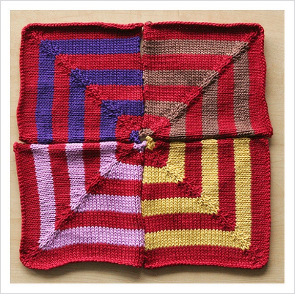
Square #21
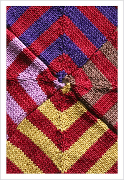
This is the altered photograph:
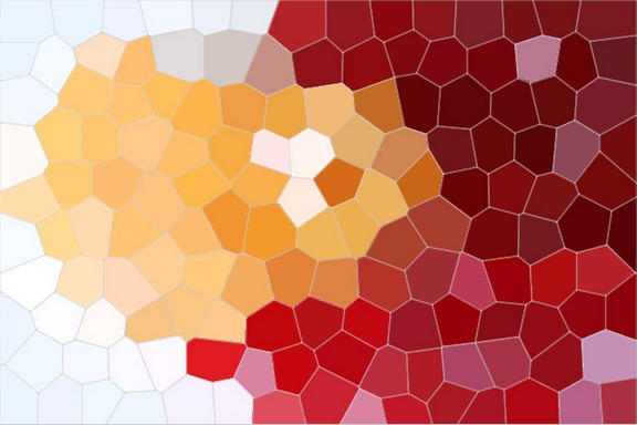
And this is the original:
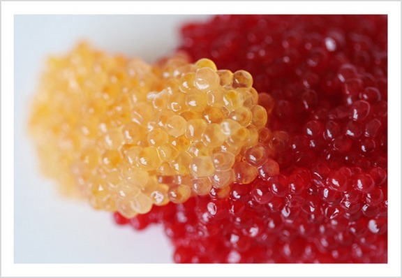
Salmon Roe
What do you think? I’m pretty happy with it!
Okay – I’m off to Guild tonight in Long Island – so no post tomorrow and another square on Friday. I have a feeling we’re getting down to the knitty gritty on this thing. Then the adventure REALLY begins!


Oooh, I love the square! The pink is really unexpected, even when looking at the original picture, but it really adds to the square.
And I have to ask- I’m not sure what the picture is of, but it looks like fish eggs. Is it?
The photoshop idea is a neat one. Thanks for sharing that!
Pink?? I thought it was purple-y lavender. (Its the same color in the miter photos as the altered photo so its just monitor confusion.)
Either way, I would not have thought to put them together on my own but I love the square. At least I think I love the square. Perhaps I need to see it RL to be sure 😉
I love photoshop. It seriously kicks butt. This idea would be a cool jumping point for a themed miter blanket. You could use only pictures from nature. Or photos of a specific person. That would be cool.
I like Wendy’s idea. You could make an Ann blanket. and maybe even start an Ann blanket knit-along …….
The stained glass filter shows colors in that photo that I would never have seen otherwise. That’s a really great idea for color selection, and it is working out well for your miter project. I’m looking forward to seeing what colors you use for the next square.
It seems to me that the Stained Glass filter would be a great way of choosing colours for a Fair Isle project.
Salmon roe – I love it!
Wow the pink is totally unexpected, but I really like it. Can’t wait to see the Friday miter. =)
I laughed out loud when I saw fish eggs on your post today! I am totally amused that you related fish to knitting… fish biologist / knitter.
Love this idea for choosing colors. I’m ready to find a project to start just so I can choose colors for it! I use The Gimp instead of Photoshop, and have had to play with the different options some, but I’m getting it!
Listen to you… “Guild.” “I’m off to Guild… on Long Island.” Whatever happened to Lawn Guyland? Huh? They’re gettin’ to ya, aren’t they?
; )
Love you, HAVE TONS O’ FUN.
I love how the red seems to hold the other colors in its grip. Containing them and letting them come out ever so slightly. If red had a personality, that is. ahem.
I have to admit this isn’t my favourite of your colour combos, but hey, that’s just personal taste.
What I DO love is the way you’re coming up with the combinations. So creative. And that photoshop thing? Very Very Cool. Looking forward to what comes next. Although I might be worried if you take Ann’s suggestion.
Colors inspired by fish ova. Gotta love it 🙂
Very nice. I have to learn the PS stained glass thingie. Very cool. Did you ever use one of those kaleidoscope viewers to view color combos?
Not gonna lie, the stained glass effect is really cool, but no. 20 is probably my favorite so far. How many more again? You’re getting so close!
Ok, well now I want sushi. Very pretty mitres – I don’t think I could choose a favorite.
Looking forward to Friday’s square.
Nice. More nice with the miters. I’m liking the miters. Don’t have much to say today, but since I’m dropping by for the second time just to see the miters… thought I should at least say so.
Nice.
I love them all! What a neat way to find new color combos. I can’t wait to see what you do next.
Damn . . . now I want sushi (like Liz). I, for one, cannot wait to see the seaming process. It should be spectacular!
Hi Cara! Thanks for the comment on the Short Rows sweater! I really appreciate your help with finding the pattern! I can’t wait to see how you put all your squares together!
Have you checked out kuler.adobe.com? A friend told me about it, cool stuff for designers or anyone who loves color. Made me think of this project. Can’t wait to see the finished product 🙂
Don’t know if you’ve been watching the totally awesome documentary series on the Discovery Channel called “Planet Earth,” BUT there’s one episode called “Shallow Seas” and throughout that episode I kept thinking of you. The colors were so stunning and amazing and out of this world. If you could record that episode to DVD and bring it into your computer… Wow. It would make for some awesome combinations. That’s my 2 cents.
woah, there’s a guild on long island? ohh please give me more information. i dont really have any knitting comrades here in suffolk county.
woo-hoo!! mitres!!
Your squares brighten my soggy days.
I’m new to blogging. Just read a few entries in your blog and wanted to tell you I really have enjoyed it. I love the blanket you’re making too. Very very creative.
I’m learning. Who knows what that could lead to?
I’m really amazed by how different the red looks against each of the four different colors…. colors are so fun! Mitres! Keep them coming!
What a fun way to play with color! I miss Photoshop, not having it on my latest computer, and you have inspired me to consider plunking down the money for the latest version.
That is a wild method! I love all the flickr toys, I have to try that one. This is getting very Dada.
What a wonderful idea! This would be great for coming up with Fair Isle colors. Thank you for sharing 🙂
That is cool. And I’m loving your blanket progress. It’s nice to play with your knitting eh?
Amazing how beautiful things in everyday life are! Not that I have salmon row on hand everyday, but if I were a sushi chef then probably.
Whoa! What a lot of fun!
what do i think? i think you and ruth are genius… pure genius!
Co-incidentally, I was just reading that post earlier! It’s great to see how someone else have applied that concept in knitting! Thanks!
I really like this square. Not that I didn’t like ALL the squares! I am so jealous of your blanket-to-be.