I’m so close on this project, I can taste it!
I wasn’t that close this morning, when I was getting ready to post. I had taken all my photographs and prepared them and was all set to upload them when I realized I had no internet connection. I checked the tvs and no tv either. Cable was out. It went back on about 5:45 PM (It went out around 10:30 AM.) Needless to say, while I did get a lot of stuff done around the house, I also figured out my next miter.
See, this morning, I was going to tell you that for the first time since the beginning of this project, I DIDN’T immediately cast on for a new miter. Not because I didn’t want to – but because I felt like I really needed to sit with the project before deciding on how I was going to end it. I know how I’m going to end it.
First, though, let’s look at the progress I made this weekend:
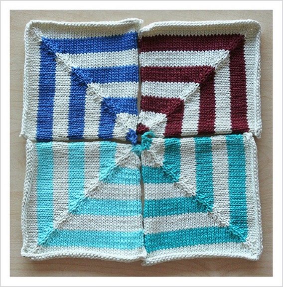
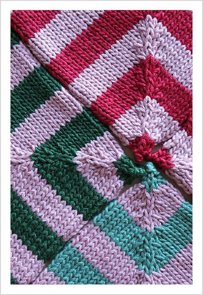
Square #23
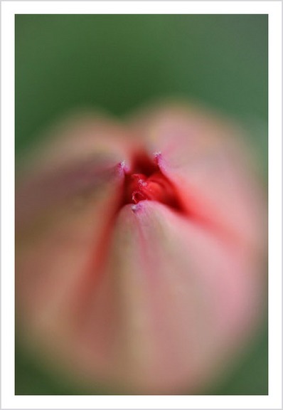
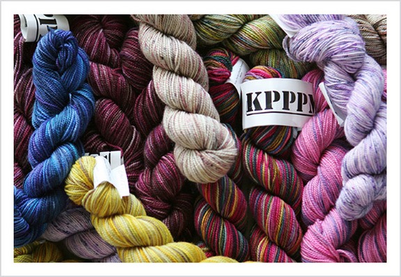
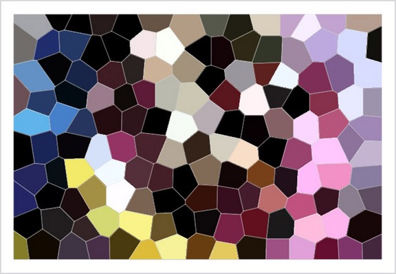
This square is yet another in the Stained Glass series based on this photograph:

I’ve taken to using the photographs as more of a suggestion than an acutal color palette and I’m enjoying the process very much. Two more squares:
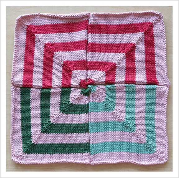
Square #24

Square #25

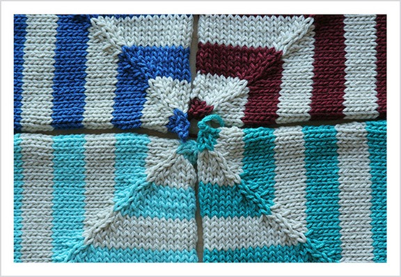
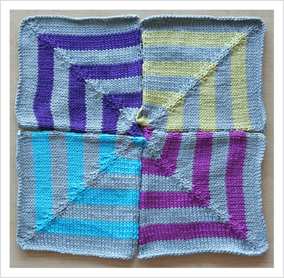
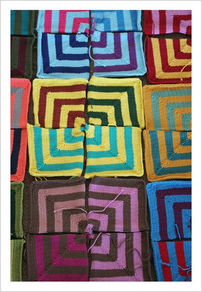
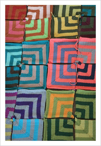
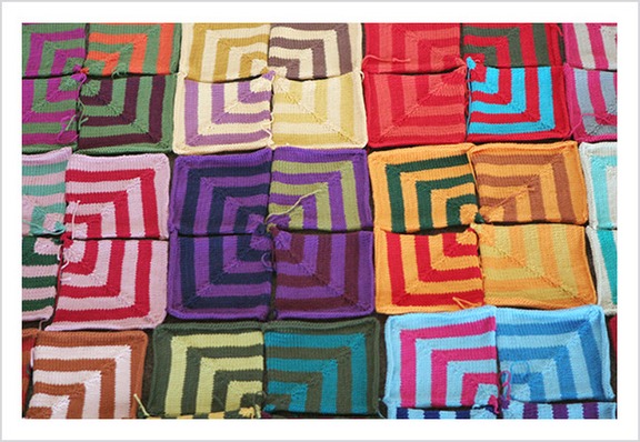
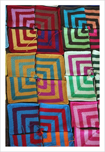
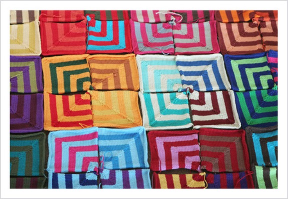
That brings my miter total up to 100 – 25 squares. I have definitely decided on 30 and the last square that I knit for this blanket will be based on the finger photograph. The finger square will anchor the blanket – it will be placed in the lower left hand corner and the layout for the rest of the squares will grow out of it. So that leaves four more squares to plan. The whole weekend I had the blanket laid out on the floor. (G was so good to step around it – especially since it was right at the entrance to the kitchen and pretty much blocked the whole passageway.) I wanted to study what colors I had used and what I felt like the blanket needed and what better way to do that than walk by it a million times a day. This is what I studied:
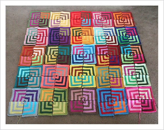
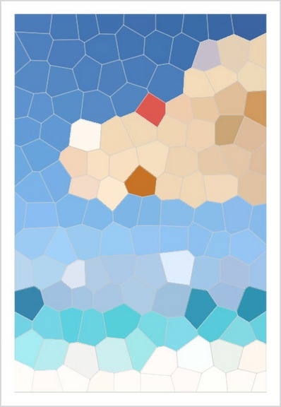
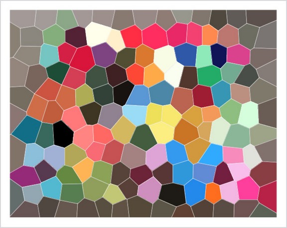
It goes without saying, of course, that this is no where close to the final layout – either for the squares OR the blanket. This is just putting it all down so I can get a good look. After I took a picture – I applied the Stained Glass Filter so I could get a better idea at the colors represented and hopefully what I need to concentrate on for the last four squares.
I’ve already started a mainly purple square because I feel like it needs purple – and I’m using lighter colors for the main color because I think it needs some lightening up, but I’d love to know what you think it needs. It’s become very hard for me to be objective anymore. I have to say, though, I am LOVING what I’ve got and am so excited to put it all together. I just hope I don’t drive myself crazy with the final layout.
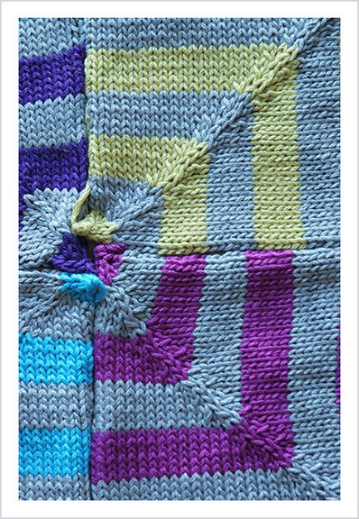
Here are a million more pictures of the squares laid out – I couldn’t resist. Feel free to skip over.
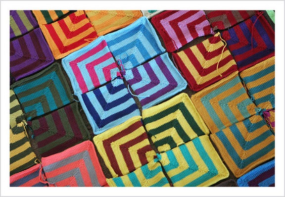
So? What do you think? Fantastic, no? Okay – so maybe you feel like your retinas are being blown out, but I’m very happy. Very very happy. EXTREMELY happy. I can’t wait for this to be FINISHED. I told G I was getting to the end and he said that’s great! What’s next? What’s next indeed! (Someone’s bound to ask – most likely I’m going back to the KH Cardigan.)
For those of you doing the Mason Dixon miter, Kay gave me a tip that can help you get into a rhythm on the miters. For every decrease row that has a stitch count divisible by 3 BEFORE the decrease, you do a SSK, K2TOG, K2TOG, knit to end (should be the same number of stitches as BEFORE the decreases.) On the rows that DON’T have a stitch count divisible by 3 – you do a SSK, SSK, K2TOG then knit to the end (should be one LESS stitch than the number of stitches before the decrease.) Trust me on this – it works. The first few miters I was doing all this division, because, you know, I’m math-challenged, but it’s pretty intuitive now. I also know that when I’m using my “main” yarn, I’m going to have two decrease rows that are divisible by 3 (the first and the last) and one that’s not. The opposite happens when I’m using the contrast yarn.
Whew! Before I sign off, I wanted to let you all know that I’m not going to Maryland Sheep & Wool this year – family stuff came up and it was too much of a pain in the ass to get down there around the family stuff. Not to mention the fact that the last thing I need to be doing is buying more yarn or fiber. So I won’t be organizing a knitblogger meet-up, but I understand one is being organized by Gryphon. So go on over there and check out the details. Have a blast everyone! (At least this year there’s NO WAY I can be blamed when the STR sells out in five seconds flat. So don’t even try it.) (Oh and if there’s anyone out there willing to buy me a t-shirt, I’ll paypal you the money ahead of time and hopefully make it worth your while. BUT only if you’re planning on standing in that hideous line anyway. I don’t want anyone going out of their way. THANKS!)
Okay. Back to mitering. The finish line is calling!


It’s looking SO good. Really, if I ever get to making this blanket, you are going to be my inspiration. And since you asked, I think it needs more yellow and orange based colors.
You’ve totally inspired me with this project. I went to a LYS this weekend that is going out of business and bought a ton of cotton!!! I have a more sytematic blanket in mind, but you have been the inspiration for it. AND….I can guarantee that I will not finish it anywhere near as fast as you have finished yours.
Thanks for the inspiration.
Tammy
Ok just remember you asked. I love it all. Consider using other colors that may be in your bedroom for more square choices? The square smack dab in the middle is light colors and looks like a floater to me. Make that one a darker (more grounded square)? But of course you are doing another row so it won’t be smack dab for long. It is great. Don’t listen to me or anyone. Love the sherbertiness of some of those squares. Rows of multi color all around? I gotta do one. I did one and felted it. It made me nervous.
My jaw dropped the minute I saw the squares all laid out. It’s fabulous! You’re going to have so much fun playing with layout and deciding just where you want what. Remember the squint technique…it will help you see what to put where. Fabulous dahlink…fabulous!
This is amazing! What a great idea! I wish I came up with it but since I didn’t many virtual pats on the back to you.
Congrats!
The blanket looks SO GOOD! I would suggest some bright, warmer colors- like the shades you see in spring- leaf green, the just-short-of-fushia pink, sky blue, etc. However, any color put in there would be neat- the stained glass filter on the blanket is really cool, too!
cara, that’s seriously so nutz!
kinda like that saying, “i don’t suffer from insanity; i’m enjoying every minute of it!”
i don’t know that i’d do a blanket like yours any time soon, but you can bet i’m gonna harbor jealousy the moment you finish it.
and you deserve it. that’s quite an undertaking!
i wish i had the drive and patience and time that you do to knit such a huge blanket. dayum!
get on with your bad self, girl!
soooooo, what are you going to do with all the leftovers?
I love the squares all laid out. The blanket will be beautiful! And the stained glass feature really gives a great perspective on color. When I looked at the stained glass pic of the whole blanket, what popped out to me was that there is a lot of pink. But maybe your bedroom is pink. Or pink is your favorite color. It’s funny, but when looking at the blanket I don’t get the same feeling. I’m sure whatever you choose will be great. Keep on mitering 🙂
Cara, the squares a gorgeous. I think it could use some light purple and maybe a little light blue as well as a little yellow. I’m not oing to get to MDSW this year either…and I live in Baltimore! My husband and I have to leave for a conference on Saturday morning after chairing a large function on Friday….I think I’d rather be at MDSW.
Wow, it’s looking fabulous Cara!
How about some navy blue and bright red? I agree with adding purple too.
Can’t wait to see it all finished.
I can understand why this makes you happy. Just looking at the pictures makes ME happy (and I thank you for that). I love this project so much. It’s amazing. I don’t have any color suggestions because I think you’re doing just fine on your own!
I love square #25! It’s just gorgeous! And seeing it laid out again is just wonderful. What a beautiful blanket!
It’s so much fun, watching you do this! I would just keep playing and rearranging and never actually get around to seaming the thing together. Kind of like building blocks for crazy grown-ups. (grown-up-ish in my case)
I think adding some purple is a good idea. Perhaps some more primary colors, too? I’m thinking plain red, navy, green and yellow.
When squinting at the stained glass pic I’m seeing a need for a cool yellow. Seems like plenty warm yellows, oranges and browns. But yellows would be easy to add along with the purple.
I think collectivly we’re all as excited as you are to see it.
O.k. so I’ve seen (and owned books) about people in love with that miter and I just didn’t get it until… I stumbled along this page. That is soooo totally cool. What great fun. It’s simply stunning. Thanks for opening my eyes!
The blanket is BEAUTIFUL!!!!!!!! I’ve been inspired… except that I’m doing a log cabin blanket right now… I can’t wait to see it finished!!!
I have to admit that I didn’t know how I felt about using the same color throughout. I’ve never done that for my blanket and I couldn’t tell how the final product would look. May I just say that it looks absolutely stunning! Individually, the squares are really pretty, but together, they take knitting to a new artistic level. Bravo! Have fun seaming . . . that’s when the real madness begins.
Cara,
It’s a thing of beauty, really! I agree it could be a little lighter – definitely more light purple, maybe some creams? Purple & cream, purple & taupe?
I actually love the two that Tina “inspired” with Pebble Beach & Hot Flash.
I think there’s a pretty good balance already though – maybe just rearranging some dark & light squares will do the trick.
The (almost) finished project looks fantastic! I think you’ve achieved a wonderfull rhythm of colours and tones. Really, really well done. I’m in awe. You have a great eye.
WoW! That took my breath away! I just wasn’t expecting it! I’ve gotten so used to admiring each individual miter…wasn’t prepared! Cara, your blanket looks AMAZING!!! Great job! I’ve learned so much about color just by watching you experiment! My two cents, I’m a blue girl…you have lots of light blues in there, maybe some darker? And do you know where you are putting it…any colors from that room that you want to represent more?! Just a few precious miters left….go girl!
Not just to follow the trend, but WOW. You have an incredible color sense–and a wonderful dedication to get all this done–I want some of that for myself–I am defintely a short attention span sort of knitter. Your work is inspiring–thanks for taking all the time to post the photos that show the stages of the project.
Really, really amazing. I don’t even know what to say — it’s just stunning.
You are truly amazing!! What an eye for color and a talent you have. Thank you so much for sharing…I still want notecards of one of the pictures….I look forward to your posts. Thank you again…
Cara, your squares (and the photos of them) are just beautiful . . . I love it.
This project is beautiful, and it has been very interesting to follow along with your whole color study. I think I would add some more green, if it were up to me. I can’t wait to see the finished project.
Simply gorgeous!
For colors “needed,” I’m thinking a bright green. As well as a cool red and (as a previous commenter said) a cool yellow.
You’ve inspired me. I subscribed to your RSS feed just before this blanket saga started (though I’d peeked in randomly for a long time before this), and I’ve really been enjoying watching it build, and seeing the way you’ve gotten to play with colors. Makes me wish I had space for a stash of similar yarns in multiple colors — or that I could bring out my fiber dyes again.
I think the purple sounds great. And it was so exciting seeing the squares laid out together. The center top square in the first picture is one I was initially concerned about- the original photos didn’t seem to have very much contrast in the orange/red miters. But seeing it in this photo, even though this isn’t the final layout, makes me a believer.
And that last photo, with the diagonals? Looking at that is what I imagine doing drugs would feel like.
Wow! The blanket looks so good! You’ve really nailed it with all of your color selections. 🙂 I also CANNOT believe the speed at which you have worked through this blanket. Amazing!
Just tuning in. Have we discussed the Chuck Close aspects of this project already? cool.
Holy cow that blanket is going to be AMAZING. Seriously lady, awesome. Your excitement is totally warrented.
WOW! I’ve been checking in fairly regularly – some of the color combinations really worked for me…others not. BUT, when you put it all together it really looks fabulous!
First of all: WOW!!! it looks so beautiful and your knitting is really amazing. Second, I decided to share a crazy idea playing in my head for a while now, or to be more exact, since you posted the first “arranged blanket” on April 10th. I think you would not like it but as you asked for ideas here is mine:
Did you consider mixing the miters and making all sorts of arrangements not in the intended squares arrangement? this was the first thing I wanted to do when I saw your post on the 10th,,, I think it may give you new ideas on color combinations, maybe. My first thought was: mix them, mix them and see what randomly comes out.
It looks great! I would vote for more yellow… of course I like yellow and some don’t, but since the sun has reemerged on the east coast I think some yellow is in order.
That is an absolutely gorgeous blanket. The one thing I would do, because I’m obsessive like this, is ALWAYS put the miters that are identical at a diagonal from each other. You did it with the two-tone green one in the lower right-hand corner of “miters19,” and I think it looks really good like that.
Whatever final arrangement you choose will be so wonderful, but it is amazing what your stained glass filter is teaching your color vision! I am looking forward to seeing your final product; just like arranging quilt squares, there will be a combo that says “stop, I’m it!”.
You have done a great job. Wow.
I think for the colors you need some tan/dark cream tones, a true red, and a spring leaf green (“nature’s first green is gold” kind of thing).
I disagree about the purple, though looking back there aren’t many with the base as purple. I guess the purple stands out in the individual squares.
Again, way to go as you approach the finish line!!
insane. and fabulous. you are one crazy knitter. i am completely in awe of your talent. and jealous, too.
“Feel free to skip over.” Are you kidding? I love your pictures, especially on this project!
I really do think it looks fantastic! I can’t wait to see what it looks like when you are done. I think that making the one based on your finger as the center is such a great idea!
I can’t get enough. I’m so going to miss these squares when you’re done. Each is an epiphany and you’ve taught me lots about colour mixing.
I hope you don’t fret too much about the final positioning. They are all lovely and will all affect each other in a myriad of ways.
There is a great flow and relationship there even now.
orange, and a brighter shade of green. Or, nothing.
Honestly, I think I am more excited than you are to see the final layout. I second the above comment about not fretting too much about the positioning, they are so beautiful and vibrant. Also, as a new knitter I am completely in awe of your color sense and the callous splitting…
Your blanket is going to be so awesome! I love love love those squares!
If you didn’t already have someone offer, I can pick up a shirt for you. E-mail me the specifics (size, color, etc): hlthyskincanbyrs@verizon.net
Oh my goodness, Cara. I love, love, LOVELOVELOVE your blanket. I wouldn’t change a thing and yet, if you did, I wouldn’t mind at all and wouldn’t change it again, and yet… I really and truly believe that however you lay it out, it’s going to be perfect. I don’t think you could make a mistake with it if you tried. Perfect.
It’s a 10. How do you like that? You’re not even finished yet.
I came late to the game on this project (hadn’t been reading your blog for a while) and haven’t read all the comments, so I don’t know if someone has already mentioned this. For a while I’ve been thinking that it would be neat to knit something that shows how one color can look different depending on what colors are next to it. Lots of your squares show this really well. For example, look at sq 7: see how much lighter the purple looks next to the light green than it does next to the wine? Or sq 9: the red looks so intense next to the turquoise, but is faded beside the pink/orange. Sq 18: the green against the wine vrs against the bright pink. I could go on and on. On some of the squares the difference is so dramatic that I wondered if you had used different dye lots! Your project is super cool, and more so because it shows this fascinating aspect of color so well.
Seeing the squares all laid out is fantastic!!
God, I love looking at pictures of your mitres. I’m going to miss them when they’re gone!! *sniff*
You. Are. A. Knitting. Goddess!!! (had to say it) 🙂
I guess I’m really just that unimaginative because I don’t see that it’s missing anything color-wise. It looks pretty awesome the way it is!
Bright Glorious Orange. Like orange peel orange. That is my suggestion for a wanting color. Love it though, and now thinking of buying miles of cotton to make my own…
The miters are so pretty. The ones with the white will help brighten it up.
I think that you might want more red. In the stained glass effect didn’t seem to pull any out.
It’s so pretty – I love it. Excited to see how it finally turns out!
:: stunned silence ::
/Scrolling back and forth to check where individual squares ended up in the big blanket. /Studying how the colors look all jumbled up vs square by square (because some of the individual squares didn’t appeal to me on some level (too brilliant usually) but it looks fabulous all together. /Wondering how to pull this off on my own without following someone’s established pattern/color choices… there’s still no words in my head. It is just breathtaking.
Oh. And I did buy 10 pounds of yarn in various colors (thankyouverymuch, my dear Enabler.)
Wow, that’s awesome. I showed it to my husband the other day to see what he’d think of such a thing. Even though I hate finishing, a miter blanket is starting to pull on me. I can’t wait to see it done done.
Those pictures are soooo inspiring! Now I want some miters too!!
Absolutely beautiful, so much more vibrant than I had imagined – a true art quilt
Hi, I’m a fairly new reader. I have to say that I wasn’t that positive to this idea seeing the squares one by one, probably because I’m anal and need things to be even and colors to have a pattern to them, and the thought of just picking up a few different shades of yarn and knit myself a miter, well, it makes my brain implode. Despite all this, I love the result! Put put together it looks so AMAZING that I can’t even get nervous about the randomness of it all. I love it!
I can’t see the pictures! They’ve exploded in cyberspace or something. I’ll check back, coz I love all that stained glass stuff!
holy crap it looks freakin fantastic!!
Joseph’s blanket 🙂
I’ve been playing with the stained glass filter ever since I saw it on your blog. It is indeed really cool. The blanket is pretty cool, too.
Thanks for pointing the way to Gryphon. I was wondering if anyone was meeting up this year.
I find it amazing that so many colors in one blanket work so well together. It looks incredible!
I’ve loved following you on this project journey. The only comment I would make is don’t overthink the layout. Spread out the lights and the darks, but don’t try to overmatch the colors with each other. The best thing about mitered blankets is the randomness and the impact of all that intense colorplay.
May be it’s a change in lighting, or monitor, or my mood, but the color didn’t attack me today. 🙂
I think it needs a mitered border around the whole thing in just one color to sort of frame the whole thing. It would be a hell of a big task. Perhaps it could be a strip that you knit on as you go….
I do admire the skill and determination you’ve put into this.
Fabulous. Just fabulous.
Fabulous, darling!
Truly a thing of majesty. The only problem is the thousands of thousands of possible combinations available to you. Don’t you love choice?
Every time I see all of those squares laid out, I feel a desperation come over me and a certainty that I need a mitered square blanket. I doubt my fortitude, though, so I will just have to live vicariously through yours.
More purple never hurts. 🙂 It is really stunning, very vibrant (or retinal searing – your choice). Whichever, fantastic job!
I’m in awe of your color sense! Your miters are absolutely gorgeous, and I will be sorry when the slideshow of beauty is complete and there are no more updates!
Thanks for sharing your methods – I’m learning just by watching what colors you put together.
It is absolutely beautiful. Congrats. What do you think about more blues/greens/blue-greens?
hmm… (besides the fact that i think that it’s looking GREAT)…
i think you’re right with the purple…
and some light colors…
may i also suggest some dark brown? (not deep like almost black, but perhaps a nice milk chocolate? 🙂
That is just so heart-breakingly beautiful. *sigh*
Cara, Been reading your blog for awhile, but I’m not sure if I’ve ever commented – I’ve been totally and vicariously enjoying your miter experience 🙂 I never used to be that into color until I became a knitter and now it just makes me happy.
This post is awesome because it shows the (almost) fruition of your project – and it is so cool to see all those squares together. All those colors are so happy to look at – and you must be so pleased, YOU made every one!! I’m very excited to see the finished project 🙂 It will be one for posterity.
(BTW – some of my best friends are from Newfane and still live up that way, we went to Keene State together over the border in NH – so it was fun to see in your “hundred things” that you were married there. It’s a beautiful place!)
That blanket is JUICY! I wasn’t sure what it would be like just seeing the individual squares, but it is amazing put together. Will you do some kind of edging/border?
I would be happy to pick up a MS&W t-shirt for you, yes I’m going and standing in that crazy line anyway.
Fantastic – yes! And isn’t it amazing how much you can get done if the internet isn’t working. I mean, I love my internet, but it’s impressive!
Oh, it’s so gorgeous I can hardly stand it!! Honestly, the energy vibrating off that thing is just awesome. And I just love, love, love reading about your process, how you come up with your vision for each square. The stained glass thing is genius. Can’t wait to see the FO!
I love it just the way it is! I can’t decide on one color projects.
Lady, it’s absolutely GLORIOUS.
If you aren’t coming to MDSW, how can I then come to meet you and get tongue-tied like a celebrity-struck teenager again?
FINE. I’ll be glad to get your tee for you; I think I saw one other offer, but if you need it, let me know and I’ll take care of it for you.
yarngeek at yarngeek dot com.
The blanket is going to be absolutely breathtaking. I feel a copycat project coming on. Damnnit.
In my limited multi-colored blanket experience (one patch blanket and one log cabin) this was the point where I started freaking out about which color to use. Having a system (the mosaic is a beaut!) seems to rid you of this, it’s all there, with endless possibilities. This project has been fascinating. Madness for you, yes, but a great vicarious knit.
Square 23 and 25 are my favorites! I love that you’re finishing with your war wound. So. Close. To. Finishing. In this house, that’s where new things get cast on and almost finished things get tossed aside for about 6 weeks!
I agree with your feeling that it needs more purple; but then I’m disposed to think almost any color scheme can benefit from more purple. I really like the color balance — I might count up the muted and bright squares and see if you need more muted or bright, or an equal number of both.
I’m wondering if it needs more green. (Seriously. I would have thought you would have been the last person to go light on the green, but I see relatively little there, especially of the brighter shades.)
I absolutely love that tulip photo. Audrey the tulip.
Cara, it is looking absolutely amazingly fantastic, I love it and hope it doesn’t drive you too nuts at the end.
Of all the blanket projects I’ve seen come out of this pattern, yours is my favorite. If only I had your color sense. sigh.
It’s looking totally awesome — if I didn’t already know I wouldn’t have the staying power, you might inspire me. I’ll be happy though, to start implementing some of the digitized color work ideas I’ve seen — I’m loving the “Playing with Colour” class (thanks for steering me that way) and I’m quite enjoying your stained glass inspirations.
It looks just great! I love all those colors. For the last miters, maybe more orange?
Hey Cara – this is stunningly gorgeous!! Well worth all the maddening effort, I think. My two cents: keep brightening it up, instead of lightening it up. I love all those bold bright colors, and I think the contrast between bold/bright and bold/dark is lovely. I’d go for more orange, personally. Another idea? Go to the library’s art book collection or (since you’re close to NYC) a museum and have a walk around the paintings and prints sections. You might get some interesting ideas on color combinations you hadn’t thought of, and it might help to step away from your work and come back to it after being saturated with some other colorwork notions. Might just work! Keep enjoying this knit – really, it looks just beautiful. ~gabriella
Absolutely beautiful!! Truly a work of art. Every single square on it’s own is just so pretty. All together — amazing!!
Now . . . what are you going to do when this is all done? 😉
I don’t think that you need to worry about balancing the number of blocks that are bright/muted or purple/green or whatever. Some colors in the mix have more “weight” than others and if you try to balance by quantity, you might not get what you want. You’re the artist–it’s your call. Here’s a thought: Sometimes my husband will do a painting that’s heavy in a particular color, but it’s balanced in value and temperature, so it works. As I look at the blocks laid out and the stained glass-filtered image, it’s the warmth of the overall image that strikes me. I would be inclined to keep that as the area of emphasis and then work to balance (by weight) value and color. Or just do what comes naturally, cause that seems to be working for you! It’s beautiful, simple and complex, homey and sophisticated–all at the same time.
miter, miter, miter..
Definitely more yellow. And also, some white or cream to set off some of the other colors. It’s so pretty!
It’s absolutely gorgeous! I won’t pretend to completely understand all the past posts concerning colour spectrum but your end result is wonderful. In terms of balancing the colours, what about a square like the one in the centre in the top row? With orange and red?
The blanket is phenomenal! Can I ask, did you have that yarn in your stash or did you purchase it from the colors in the filter thingie?
It is beautiful. Now I am rethinking my approach to the arrangements of color…
i am in awe! being a mostly-knitter-part-quilter this is an inspiring post.
check out my favorite quilting pattern: bento box
http://reprodepot.com/pnbntbx.html
see why i love your project so much? congrats. dont fuss too much over the placement. each square has its own innate beauty and that will show. best of luck on the home stretch!
My retinas are stinging a little bit I think, but I LOVE it!! It’s looking sooo good! And really, you may be almost done with the knitting part, but the fun is just beginning! Hope you like to mattress stitch…
I just love your miters, so bright and happy looking. I’m looking forward to seeing the finished product, although I’m afraid that will completely push me over the edge into the miter blanket abyss of need…
I just recently started reading your blog and I was thinking to myself what is up with all these stupid miters (sorry that’s how I felt). I kept skimming the posts thinking someday it will get better. Well today it did my friend! I was thinking to myself there is no way it is going to look good all put together. Well I was wrong!!! I LOVE it!!! I may actually have to think of doing this for myself. You have such creativity and vision. Well done!
Are you going to put a border on the blanket? If you are, then do you have a color picked out for the border. I think a (if possible) dark vibrant blue would be nice for a main color for a square. It is so lovely.
Kaffe Fassett would be proud of you.
Just stunning in its explosion of color. Hats off. I could never do something that big.
totally frigging AWESOME!!!!!!!!!!!!!
I love it 🙂
Speechless, I am inspired! Your creativity is a blessing in my life!
I really love it–it makes me happy to look at it. Your photos make it all seem so fun and entertaining–even if it seems to consume you! Love your sense of color. I kept going back to the main image, and I find my eye is distracted by only one square. The very lower left. It’s like a chunk taken out. But if you use it on a bed, then that won’t matter.
Cara + fiber + needles + photographs = Gorgeous Art
It’s aweseome!!!!
It’s incredible. I could look at it for hours. No wonder its occupied you this way. It really is compelling. Congrats!
Just amazing. I am so impressed at your progress too!
You and Kay must share some sort of special (albeit slightly freakish) gene that allows you to crank out (over and over and OVER) perfectly perfect miters and make it look so effortless. I have felt a little bit like a peeping tom this whole time, watching and not commenting on the fascinating progress of your blanket.
As for colors, I have looked at the pictures over and over trying to see if I could pick a color that needs to be added. I think you have plenty of pinks (but that may be a personal bias) and you are right about adding the purple but otherwise, I just don’t know. I look and think, maybe add some green and then I think no, no there is a good balance of greens. Then I think maybe some blues but you have great blues. If it were my blanket, the only color I would possible think is lacking here is maybe red. Of course, I have read previously that you have struggled with finding the right TCC red so…umm. Ok so maybe some red if you have one you love and you can find happy co-colors for. But really, this, too, may be my own personal bias, and you have done such a stellar job of color picking so far that I’m really not sure you need help from any of us…least of all me.
After ages and ages of reading and not commented, here I am blabbering on….
Medium green (kelly). Medium red. Maybe a couple of neutral-ish colors.
The math fiend in me would make a chart of what color combinations have been done already, including info on hue and value and what they’ve been paired with, and find the gaps. Because I don’t miter as fast as you, but I am insane in my own way.
No, but really, I’m thinking of a more advanced version of “I’ve got red, blue, yellow plus orange and green… I guess purple is missing because that covers all the primary & secondary colors.”
I’m speechless – this is amazing. I love the process by which you decipher the colourwork. I hope you have a real price of place for the final piece.
That looks really amazing! By the way, the stained glass version of the yarn photo is so pretty I had a reallyhard time pulling my eyes away from it! To me, it’s one of those perfect color combinations.
Individually I wasn’t much into this one, but as a whole it looks knock-yer-socks-off fabulous!
SERIOUS eye candy, girl… I have never mitred but this blanket is art! I may just have to do this one day…
Good God Woman! I miss reading your blog for a week or so and just look what you’ve been up to. Amazing, Inspiring, Creative, and Outrageous all rolled into one. You’re in the zone, pure and simple.
I have to admit to wondering about your project from time to time, but seeing those 25 squares laid out on the floor like that… It’s fabulous! Yes, it’s bright (my husband would shoot me, if I knit something that bright), but it’s wonderful. I love it!
Goodness me, it is stunning, C. You already knew that though 🙂 MDSW won’t be the same without you~ and yes, next time I am in NYC, I will let you know.
Oh, you should be so happy! It’s wonderful, and I’m having so much fun watching it!
that is amazing, cara: way to go.
This is the coolest freakin’ blanket I’ve seen in my life. I’ve got miter fever and I want a blanket big enough for a bedspread!
Oh, Cara – I love how you laid it all out. I’ve lost count of my squares, and have no idea how it will look. I can’t believe that you used all 95 colors…….wow! (Now, I’m off to buy more CC)
THAT is one of the most wonderful crochet blankets I’ve ever seen! Very fresh!
“Feel free to skip over?!” Are you kidding? They’re glorious, each and every photo!
I think you’re right about adding more purple. My only other color suggestion would be some bright greens; leaf, emerald, and forest maybe?