Remember I showed you this photograph from the NYT on Monday?

Remember how freaky it was that the Sol LeWitt painting they showed with the announcement of his death pretty much EXACTLY matched the square I had started the night before?
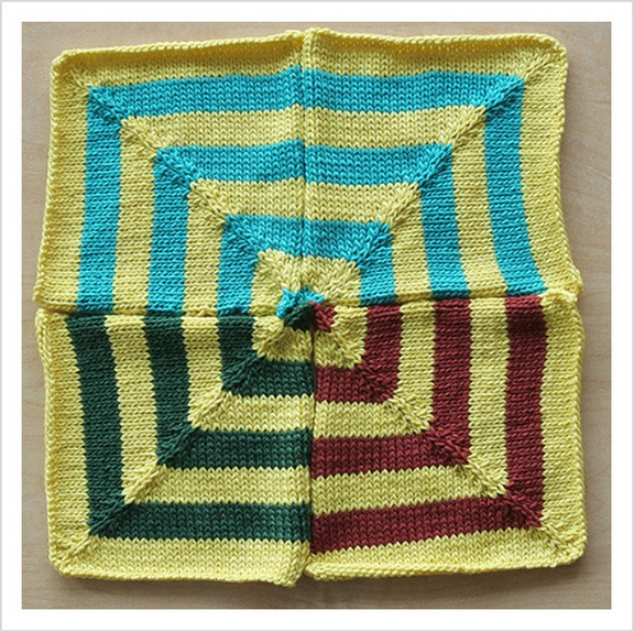
Square #17

I showed G the picture and my square and he said that I must have seen the painting somewhere somehow and I said no. I can’t remember the last time I was at the Whitney (which is where the picture seems to hang) – sadly, it’s got to be AT LEAST 18 years ago. I told him that I had never even HEARD of Sol LeWitt. Not once. The only possible explanation is that on his way to heaven, good old Sol whispered into my ear, “The yellow will look great with some light turquoise, some forest green and some rusty brown red thrown in for the accent.” Really. That’s the only thing that could’ve happened.
Any other dead or dying artists (or even living ones) that would like to whisper some color combinations into my ears – bring it on. I’m starting to struggle.
In fact, when I was putting the photographs of #17 into the gallery – I caught a glimpse of #14 and panicked for a second that they were so close – but I think it’s okay. The yellows are different and the greens are different and the blues are different and there’s rust instead of wine. So, similar, but not the same.
When I first started this project I thought I needed to be really inventive about my color choices – be BOLD and DIFFERENT! Now I’m just happy to find inspiration anywhere I can get it. I find myself putting together these great combinations only to realize that I’ve already done it with maybe a touch lighter shade of purple or a darker shade of blue. As frustrated as I’m feeling – this is the time to persevere. Many times the moment of exhaustion – the moment where everything blurs together – directly precedes the times of utmost clarity. Or at least that’s what I keep telling myself.


at a whisper: Chocolate, Fuchsia, Bright Orange. 🙂
Do you have blues and browns together? I looked at your picture of all the squares and thought maybe you do but I wasn’t positive.
Sol must have whispered in your ear…must have! How wonderful to be so inspired. Every artist struggles so dig deep and you’ll find more insight and inspiration. Maybe you should go to an art museum or gallery! (Or pull out some STR);-)
You could get mathematical about it – log the colours, create a spreadsheet of all possible combinations and tick off the ones you’ve used.
Failing that, my contribution would be: brilliant sky blue, pale grey, and a splash of rosy pink.
Piiiiiinks and Broooooooowns…. (this is my current color obsession 🙂
Meet me in Chicago this summer and we’ll take a look at the Frank Stella canvasses at the Art Institute. Is it a date or what?
It is uncanny that you are channeling Sol LeWitt through your miters. This just keeps getting better and better.
Check out Friedensreich Hundertwasser with a Google Image search. His color sense is *inspired*.
Maybe you could do a color study of some of your own (non-knitting) photographs?
I don’t think #17 looks too much like #14 (which is still one of my favorites- it reminds me of a very structured garden), and I think when placed in the larger context of the blanket, they won’t look the same at all.
And I agree with Kristy above- your photography has such wonderful colors, I’m sure you could find a few photos to use as inspiration!
Delurking to suggest a trip to the Whitney or the MOMA for color combo inspiration. I’ll be in NY next weekend and plan to hit the museums for that very purpose.
I’m very curious to see how you do the border for the blanket – I have time before I get to that point, but am feeling a bit panicky about it.
Good luck finding your inspiration. Here’s a thought … brain scans. No, really! I work at MIT and often wander through our brain and cognitive sciences building and they have several magnified images of human brain scans hanging as art. Some of the color combinations are really striking … do a google image search on “brain scan” or “brain mri”.
http://www.guild.com/artitem/39240.html
I always look at this piece when I need a little color inspiration. If i had any disposible income, I would have it on my wall.
How about using the random number generator? You may get some wacky combos.
Brown, green, turquoise, and purple. Together. In one square. Have you done that yet? I saw those colors together on the mantle of a giant clam when I was diving in the South Pacific. Brown was the main color. The combo was stunning. 🙂
There’s always the “chosen at random from a paper sack” option for color choices.
I so loved seeing the squares together in your last post. They look great! The artistic shots are lots of fun.
If you want color inspiration, try this site: http://www.degraeve.com/color-palette/. I love playing there even when I’m not looking for color inspiration.
You could post your remaining colours here and we could give you ideas. 🙂
All these ideas are so great! Similar but different is still okay isn’t it? I mean… there are no new ideas, right?
Ok, I vote for colors based on the Koigu socks I’m wearing today: pink (light), yellow, with just a splash of turquoise. And what about Project Spectrum blocks? This month: green, pink, yellow!
Take a look at some of Christopher Lloyd’s planting designs – he had a stunning color sense. There are some good ones to be found via google: “great dixter” plus “photographs” or “images” (there’s a flickr set,too) (Great Dixter was/is his garden), and track down the book “Color for Adventurous Gardeners.”
Isn’t is weird how the appealing color choices jump back out at you? When I was getting to the end, I would pick out two colors I thought looked good together and then realize that I had already made that exact combination before…
Try here: http://kuler.adobe.com/#
Cara – my 15 year old recently picked up some Christmas green and a darkis but bright turquoise Cascade 220 to make a hat. A combination that I never would have chosen myself – but it looks fabulous. I could see a pink with that and . . . yellow? GOod luck.
One with a bright orange background!
hmmmmm…a bright orange background- dark purple, bright yellow and light teal stripes…
Now I have to go look again to see if you have something like this and I overlooked it!
I think you’ve gotten fabulous suggestions from everyone. And I totally believe that the moment of exhaustion leads to the moment of complete clarity.
I’m currently knitting a pair of Monkey socks in some Brooklyn Handspun in a color called “Winter Sunrise.” It’s a different look for me, and I am LOVING it. So based on it, might I recommend orange with pink and lavender (and maybe a splash of yellow)? That combination has got a very summery, sherbety feel to it. Way fun.
Delurking to say… I’ve really enjoyed your miters and that maybe one or two very similar squares in a king size blanket isn’t so bad. It might give the eye a place to rest. All the colours remind me of my granny’s quilts and at bedtime hunting for squares that were the same was one of my childhood delights. Anyway, whatever happens, you have some mighty fine squares.
orangey red, sky blue, warm yellow and mossy green – hey I googled that “weird” name and there was a pic of a building and those are the colors “I” saw BUT then I ain’t got yore color sense!! They’ll come to you – they always do – I’m sure you have lots of muses hanging out whispering in your ear – there you go – look at some of Bruce’s “album” covers!!
Get out some magazines and start looking at just the colors, not the subjects. I love doing this. Especially design magazines like Vogue or Elle Design. It’s very interesting as well.
On of my fav color combos is a rich pumpkin with a deep plum, a bright yet deep red-violet, and a touch of peacock blue for accent… I do realize that isn’t a whisper, but perhaps it’ll spark something 🙂
You have 56 unused colors but how many did you have to begin with? I thought I saw that and when I went back and re-read everything I couldn’t find the answer. I am percolating the idea of this blanket. Collecting all the information. Letting it steep. Mixing my beverage metaphors. I also wondered if you tried the method of knitting the 4 squares together and decided you didn’t like it or if you just went with the individual squares without trying the other method (more research). I would love to hear your answers if you get a chance. Thanks much.
Have you read Wendy Knits! blog lately? She’s doing a mitre tunic and is allowing chance – chance! – to select her colors. She’s got a basic rule or two, but within her spectrum it’s turning out pretty nice. Maybe you could let fate have its way with one or two squares. This is definitely not whispering – totally not. But it could inspire you in ways you couldn’t have found on your own…
I am working on my own miters, alebit MUCH more slowly that you. I have decided to try and keep some element of brown/tan/beige/pearl/gray in almost all of my miters to add a hint of continuity through them and to offset the colors.
I have to say though, picking and arranging colors is really hard work!
Sky blue, brick reds, grey and eggshell white.
I’d suggest doing one square with no color – black/white/grays
Don’t keep ALL your yarns in front of you. Stash some and then go rediscover them. Then you’ll go uuuu (that’s U with a long sound) or you’ll go oooo (as in cooool) Yeah that looks good with this and so on. If you look at them all together for too long it turns into the same old thing. Hope your gettin what I’m meanin.
May that moment of clarity progress quickly.
Maybe you need to start channeling other artists as well. Josef Albers – the color theory master?
I love Ruth Root’s colors too – beautiful canvases!
I like to go here: http://www.colorcombos.com/ just to play around with color sometimes. Or you could mess around with a megapack of crayons…but maybe that’s just me…
What Nora said. Kuler. I went there yesterday and thought I was gonna lose my mind with the glee of gorgeous color combos. Seriously. Would I steer you wrong? No. No I would not. Cheers!
Does it matter if you use the same basic colours more than once? I mean – yes, the colours (I’m British, work with my spelling!) are very similar for #14 and #17, but the way you’ve used them is very different, so the overall effect tells a completely different story.
I’m still speechless with the gorgeousness.
A glassworker friend uses paint chips – the color samples from the hardware store? She mixes them up like a deck of cards, shuffles, and goes with the resulting draw. (I once walked into a paint store with one skein of yarn to match colors for the bathroom – and it got the attention of every male in the place. I am imagining the chaos when you walk in with 56 skeins (the unused colors) to find matching paint chips.)
I don’t know that this would be up Kurt’s alley. If Kurt whispered you a color combo, it would likely be a pretty cranky one, bless him.
I would consider looking into the artwork of the painter Chuck Close. He does a lot of things with very interesting color combinations. When you are up close it looks like random circles of very different colors, and then when you are far away it looks like a portrait.
You’re probably not aiming to make this look like a particular image but a lot of his color combinations and how everything is organized remind me of circular versions of your squares.
Anyway… it might give you ideas or at least introduce you to one of my favorite painters.
for color combination inspiration this may be helpful: http://kuler.adobe.com/