Thank you all so much for your very kind comments on Acer and previously on Aidez! I really appreciate them. I have to say I’m quite proud of all this sweater knitting. I actually have one more finished sweater to show off and talk about, but I wanted to say a little something about my new sweater project given the date.
Being flush with my sweater successes, I decided that it was finally time to try something I’ve been wanting to do for a long, long time but was too timid a knitter: a fair isle cardigan. With a steek and everything! I find it kind of ironic that I’ve been too timid to knit this because I’m usually the one preaching if you can knit and you can purl you can do anything!! But for some reason color work kept scaring me and I decided now was the time to conquer it!
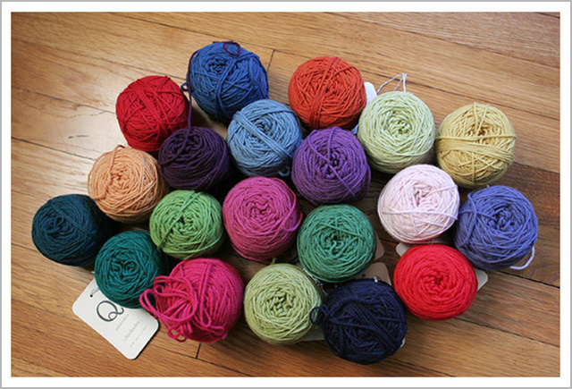
I’d had Elinor Brown‘s Plum Frost Cardigan in my favorites for a long time and I finally pulled it out. I decided I wanted to knit the sweater in some Quince & Co. yarn because they had some great colors and I really really enjoyed knitting with it when I knit Aidez. So for my birthday I treated myself to a bunch of colors in Chickadee, their sport weight 100% wool yarn:
And then I started swatching:
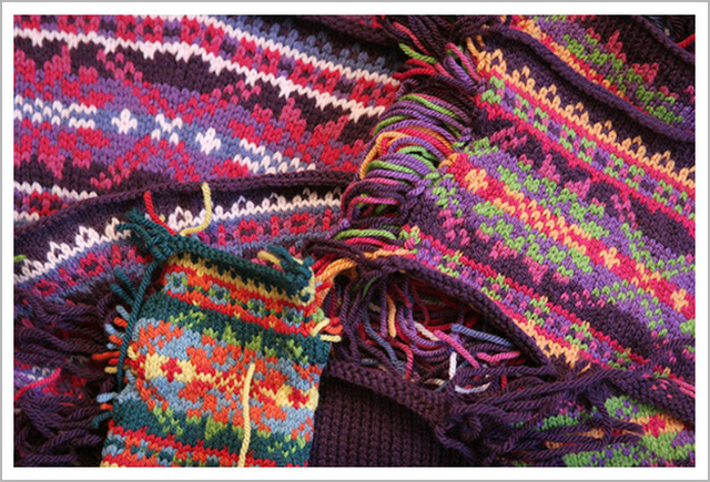
Before I even STARTED the sweater I knit no less than ten swatches, eight of which were fair isle swatches. CRAZINESS! But I learned so so much along the way. First I knit just to see if I knew what the hell I was doing. Turns out I’m not so bad at fair isle – I hold both yarns in my right hand and throw them. My left hand is basically useless. I knit pretty tight in fair isle, but the pattern even tells you to go up two needle sizes so that kind of solved that problem.
Look how pretty my floats are!
It didn’t take me long to settle on a main body color and the remaining five fair isle pattern colors and I knit a swatch, then switched a couple colors around and knit another swatch, then figured out that my gauge was NO WHERE close to what was called for – I might as well have been knitting with a laceweight! – so I switched up to Lark which is Quince & Co.’s worsted. BINGO! I got a pretty close approximation to gauge – enough that I could knit the smallest size and have it come out to a 36 – which is what I need. And as a bonus I put my gauge numbers into the Elizabeth Zimmermann Percentage System and came out with exactly the right numbers. I was ready to start!
But something was nagging at me about my color choices. Something wasn’t quite right. I ignored myself and ordered all the yarn for the sweater. I went so far as to cast on the sleeves (my first time using a tubular cast on! SWEET!) And then I called a couple of friends and asked them to look at the swatch. Margene tried to be nice about telling me she didn’t like it – that it wasn’t working and Ann was much more straight forward – this swatch DOES NOT WORK.
As much as I knew they were absolutely right, I was heartbroken. I’m exhausted. My children, it turns out, are terrible sleepers and with one hitting a stubborn four in a couple of weeks and the other already squarely in the terrible twos, knitting is the only respite I get. AND I bought the yarn. What was I going to do?
It turns out some learning.
I went to my knitting library and found Deb Menz’s Color Works. Color. The all important COLOR. There are three aspects to color: Hue, Saturation and Value. Hue is easy – is it orange, green, etc? And Saturation is easy – how deep/light a green? But Value – oh all important VALUE. Value had kicked my color ass.
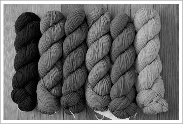
The way I understand it, Value is the way the eye sees color immediately, before it registers Hue or Saturation. Value is the BLACK & WHITE of color. So to find out the value of a color, you need to see it in grayscale.Check out these pictures:

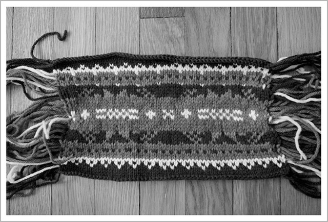
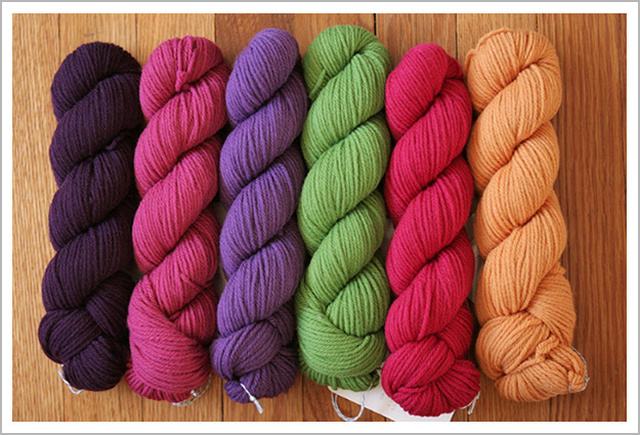
Check out that muddled muddy mess! Here are the skeins still wound:
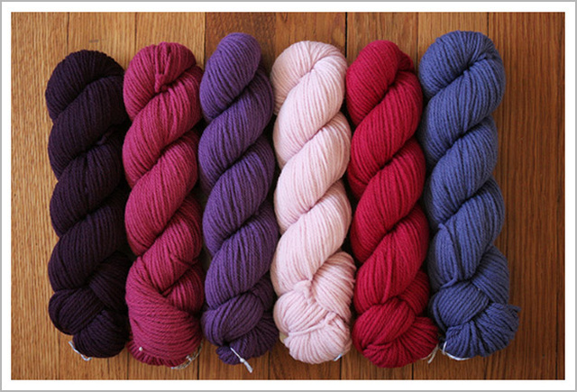
Not so bad, right? They look like a fine bunch of colors! Here they with their values exposed!!
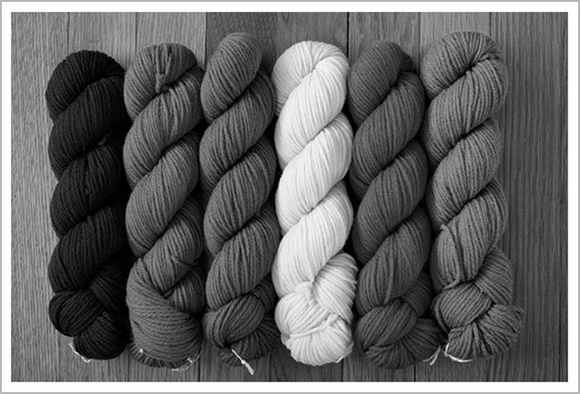
So I’ve got a very high and a very low what with the dark purple and the light pink but oh my god! The other four colors might as well be exactly the same. Three of them really ARE the same value and one is only slightly off.


Frankly, I was kind of embarrassed I had come up with this combination in the first place. I mean, true or not, I fancy myself something of a color connoisseur and it’s not like I didn’t know about value. I’ve talked about it before and everything! Really, I was very disappointed. BUT, not to be deterred! I took my book and all of the skeins I started with and into the car we went! (I say the car because that’s where I do most of my knitting these days. The baby, WHO WILL BE TWO IN JUNE!!!, has pretty much stopped napping at home and will only nap in the car. So when I drop off Meli at school we drive home, Cali falls asleep and I sit in the car with her and knit for a glorious couple of hours. It’s BLISS!)
I flipped through Menz’s book and checked out all the color combinations and rearranged them a million times in my lap all the while taking bl
ack and white pictures with my phone. Good times! My neighbors must think I’m crazier than they originally suspected! Anyway, so I’m snapping away but I’m also trying to use the least amount of new colors I can. Remenber – I’VE ALREADY BOUGHT ALL THE YARN! I want to keep the original dark purple as the main color and as many as the pattern colors as I can. I switched around and switched around and then – hey – this looks kind of nice together. Let’s see the values. Okay, okay – this looks kind of perfect!! I immediately started more swatching!
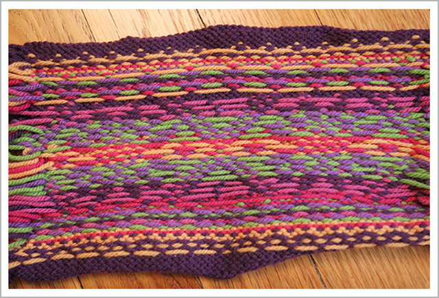
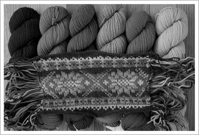
By switching out TWO colors only, I got these gorgeous values:
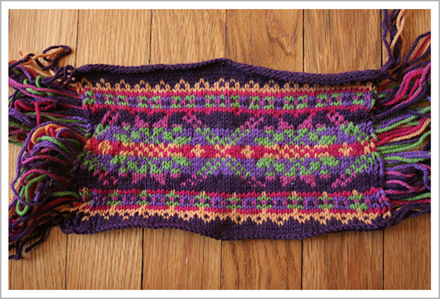

Look how well defined the pattern has become! No more muddy mess! BEAUTIFUL!
Now there is a definite high and low, but the low isn’t SO low and the middle has RANGE! Look at that glorious range! TWO colors. I changed out two colors only. Let’s look again!

Now, just for shits and giggles, let’s see the values of the original swatch compared with the values of the new swatch:
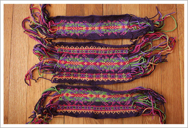
Isn’t color AMAZING?!? Blew my mind. And now I’ve got a Mardi Gras Cardigan brewing – purples and greens and gold (and yes pinks!) Completely changes the look of the sweater I’m knitting and I couldn’t be more excited. I’ve been plugging away on the sleeves and I only have two more increases. Shouldn’t be long before I start the body and then FAIR ISLE BABY!
I still have at least one swatch left. Ahem. I’ve never cut a steek before so you can bet your ass I’ll be practicing!
Happy FAT TUESDAY everyone! YAY FOR KNITTING!!!
*A day early, but who’s counting, right?


That is fascinating!
Monday, Tuesday — celebrate when you can! I love Deb Menz. And Margene. And Ann. And you. I can’t believe your baby is going to be 2.
I just learned so much about choosing colors, thank you! I have mini-meltdowns trying to choose colors for projects!!
excellent post, Cara! Knit on!
“The Art of Fair Isle Knitting” by Ann Feitelson has an excellent discussion on color theory specifically related to Fair Isle knitting, if you’re still curious about the subject. Or need an excuse to buy a book. Looks like you figured it out already, though, so THAT reason won’t work. 🙂
Wow, this is a great post. I’ve read about value before (and also like to flatter myself that I’ve got a good eye for it), but this shows what a huge difference it makes in such a clear way.
I have to admit, in the first swatch pictures, I thought you only had three colors (red, blue and white) and you couldn’t even tell it was really red, pink, purple, blue and white. The new swatch is much lovelier. I’m glad your friends were willing to tell you the truth, and that you were able to find colors you were happy with.
Wow! Thanks! I never thought of colours this way before, but this really opens up a whole new world of choosing colours!!
BTW, I love you choice of colours in the end there, Happy knitting!
Love your final choices and the reminder lesson on color value.
Wow. Just wow.
Thanks for this awesome post! I keep meaning to do some real fair aisle knitting, but the thought of choosing colors is daunting to me. This was helpful. 🙂
Value kicks everyone’s ass. Your two+ swatches show beautifully how important value is to color-work. Great job and I love your color choices! Happy Fat Monday/Tuesday!
This is an amazing post! I love how you showed all the black and white pictures to get the point across. Who knew how important value is? I can’t wait to look at some of my color choices in this way now. Thanks so much!
Okay, that was one awesome blog post on color. The last pictures were especially dramatic. I am totally sold on color theory after reading this.
And I totally understand knitting in the car while baby sleeps. Car seats are the greatest invention, I swear.
This is a GREAT post Cara. Your explanation of hue, saturation and value is wonderful AND the black & white photos are so perfect in seriously demonstrating what you are talking about. The difference in the two colour schemes is amazing. I can’t wait to see your sweater … and I love that you can actually knit in the car while your littlest has a nap. Now that is good problem solving!
Thanks so much for your post. I’ve been struggling with something similar and now I’m off to take some b&w photos. Have fun with your steeking!
Cara – That is the ONLY understandable discussion of color I have ever seen. Thank you so very much. The color/b&w photos made all the sense in the world, finally. And you have a gorgeous sweater in the making. Thank you again!
Thank, you thank you thank you. Finally something I can understand as to why sometimes my combinations aren’t “quite” right.
Wow! I’m really impressed with all of your swatching. I too have been on a sweater kick. My goal for 2012 is to knit 12 sweaters. I’ve already completed one, and have the second one knitted and ready to assemble. The third one is already on the needles. And they fit and are wearable!!! Yay!!
So glad to see you blogging again! Also, congratulations to G on the big work news!!
Wow! My mind is blown.
This is so interesting!
I’m so glad you’re back to posting. That was really one of the most informative and interesting articles on color that I’ve seen. I’ve always wanted to try fair isle, but I’ve been too intimidated. This really helps. Thank you. Linda B.
love the post. I knitted a fair isle hat in the same value and it made my eyes hurt trying to see the pattern. Taking the pics in b&w. Brillz. Can’t wait to see you STEEK!! AHH!!
Loved your post and the pictures were great. If you have an iPhone or iPad you would love the Color Splash app. It removes the color from an image then you can “paint” it back in with your finger. I’m going to be sure to use it the next time I am buying yarn. Thanks so much!
Wow! Great tutorial! Can’t wait to see the finished product – and thanks for teaching me about the importance of value in choosing colors.
Steeks aren’t too bad. I did my first one in public. I do think it was almost as trying as labor was though. You can do it! I have faith in your abilities.
Wow, what an educational post! I had never thought of color that way! And btw, I also treated myself to LOTS OF YARN for my birthday, which was 2-18. And it didn’t rain. For only the second or third time in over half a century!
Excellent post! I would have never thought of looking at it in gray scale. Awesome!
Whoa, all I can say is that is some heavy swatching. You go girl :}